 Paai Fai
Choose a style for the reading task
A different effect cannot solve every overlong message. First check length, contrast and the destination display. Then use the style to support the intended mood.
| Style | Starting use | Check before showing |
|---|---|---|
| LED | Short cheering phrases or headings | Dots should not erase small marks when viewed at a distance |
| Neon | Atmospheric messages | Lower glow if letter interiors merge |
| Plain | Collection points and quick instructions | Reading distance and phrase length |
| Outline | Large words with time to look | Thin strokes may be hard to see on a small screen |
| Retro | Short themed messages | Glyph shape and spacing on the actual device |
| Rainbow | Decorative multicolour words | Some colours contrast with the background less than others |
Edit the sentence before increasing speed
Replace “We would like to inform all customers that orders can now be collected at counter number two” with “COLLECT ORDERS AT COUNTER 2”. The useful instruction remains, but the viewer no longer waits through the introduction. Making a long sentence faster can make it harder to finish reading.
The preview scales down the presentation for this device. Speed is measured in presentation pixels per second, not pixels travelled across the small preview. Recheck fullscreen when moving to another display instead of judging the thumbnail alone.
- Start with one action or sentence, choose Left and set an initial speed.
- Try reading an entire cycle without relying on having memorised it. Slow it down or shorten it if necessary.
- Split separate ideas into message sections. Use scenes when each idea needs a different design.
- Check complete glyphs and play every section before exporting a clip.
Choose a readable style before adding effects
The six styles are LED dots, neon, plain, outline, retro and rainbow. Plain white text on a dark background is a useful starting point for practical information. Neon adds glow; rainbow uses different colours across the line, so contrast varies within the message.
Choose a font and weight, then check the preview at the intended size. Letter spacing can help short headings but may make a long sentence harder to fit. Readability advice in Layout checks the main colours and selected settings; it does not measure your actual viewing distance.
Choose speed and Thai fonts
Read from the intended distance. If you cannot finish, reduce the speed or shorten the sentence. A larger font helps at distance but makes a long sentence take more time to cross the screen.
Try Noto Sans Thai for general text, Mitr for rounded letters or Noto Serif Thai for a classic look, with a contrasting background. Check Thai vowel marks and emoji on the actual display device, because emoji fonts differ between systems.
Scroll, hold or split the message
Use left or right scrolling for a moving message. Still mode fits the line to the screen and can hold each section for a different duration. The text splitter accepts lines or paragraphs and checks the limit before replacing your existing sections.
For a long message, divide it into short sections rather than increasing the scroll speed. Paai Fai supports eight sections of up to 500 characters each. Empty sections are skipped. Different designs belong in the scene playlist instead of the text queue.
Scroll multiple lines vertically or diagonally
Press Enter in the message field to display up to eight lines together, sharing the same typography and scroll angle. The Multiple lines, scroll angle and templates panel controls line spacing and can restore single-line display. All lines together use the section's 500-character limit.
Horizontal is 0°, Vertical is 90° and Diagonal is 45°. Choose a custom angle or Reverse; upright letters move along the path. Text rotation in the layout tools separately tilts the letters. Queued sections advance when the whole block leaves the screen.
Choose a previous message, saved board or scene as a template, then Apply this text style. Text formatting and motion are copied while your current message, artwork and background remain. Duplicate a section to copy the complete multiline message for further editing.
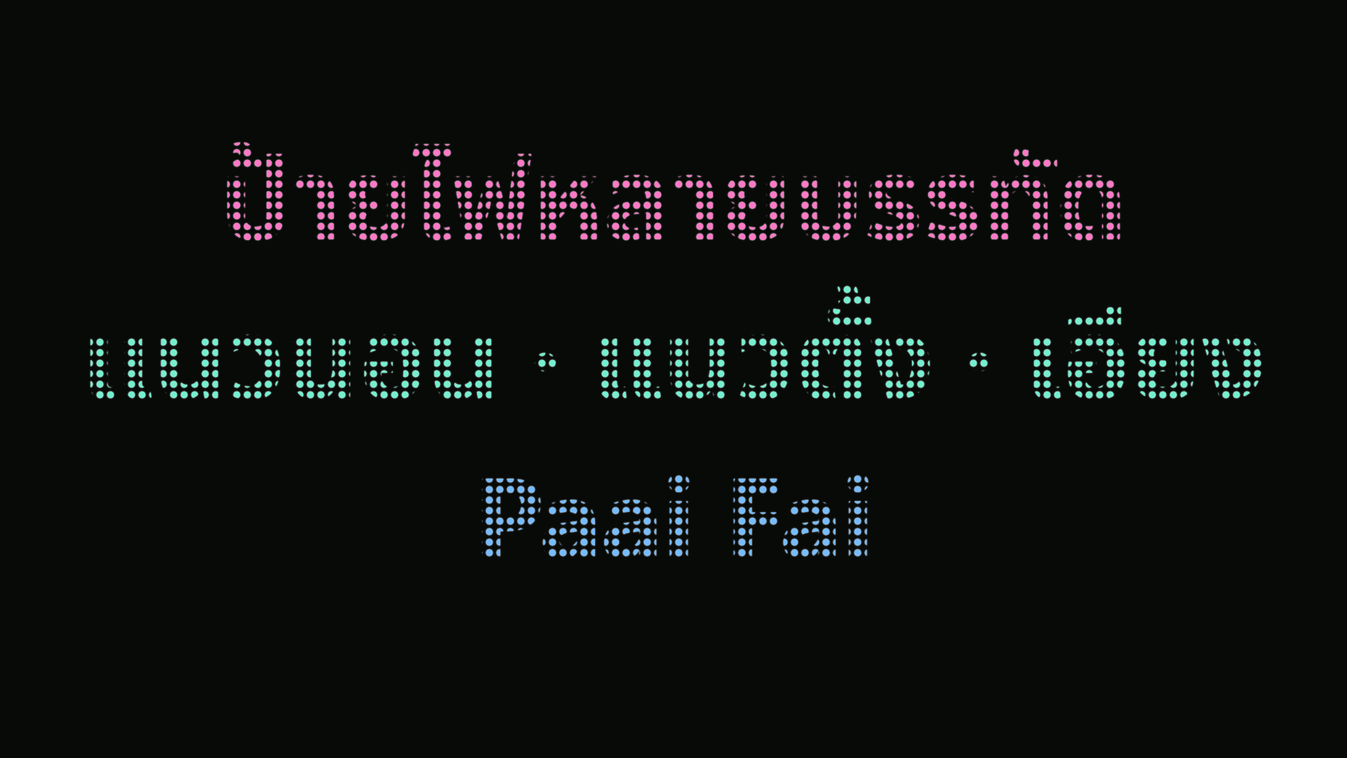
Highlight words with different colours
Open Word colours below the editing controls. Choose a suggested word or enter an exact word or phrase and pick its colour. Up to eight rules work across message sections and bilingual text; Thai does not need added spaces.
Exact matches share their colour. The longer phrase wins when two rules start at the same position. Quick palettes change only word colours, preserving your text, images and drawing. Word colours override Rainbow; unmatched text uses the main colour. Check contrast before displaying your sign.
The same colours appear in all six styles, separate displays, PNGs, silent videos and editable project backups. Share links carry public words and colours, while private artwork stays on your device.
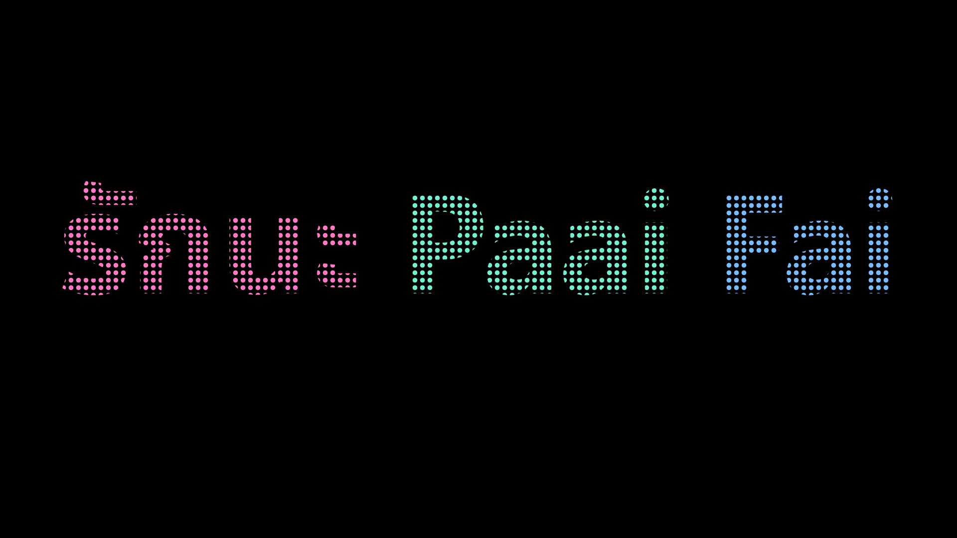
Add photos or logos
Add up to 12 local photos or logos. Drag to move, use corners to resize and the rotation handle to turn an image. Reorder images and text so important words stay visible.
Display and export
On mobile, fullscreen requests landscape orientation. If the browser or operating system declines, the sign area rotates instead while controls stay upright. Choose Use original orientation to return. This display-only rotation does not change saved text or artwork angles. Fullscreen and keeping the screen awake depend on the browser and operating system. Reduced-motion preferences start animation paused.
PNG creates a still image with local photos and drawings. Video is silent and uses the format supported by your browser. A share link contains text and settings, not the files stored on your device. Test exported files in the software where you plan to use them.
Frequently asked questions
Can I create scrolling text without installing an app?
Yes. Open Paai Fai in a browser, type, choose speed and direction, then display fullscreen without an account.
Does a shared link include private photos?
No. Links and QR codes carry text and settings. Use PNG or video for finished artwork, or a project file to continue editing with local photos.